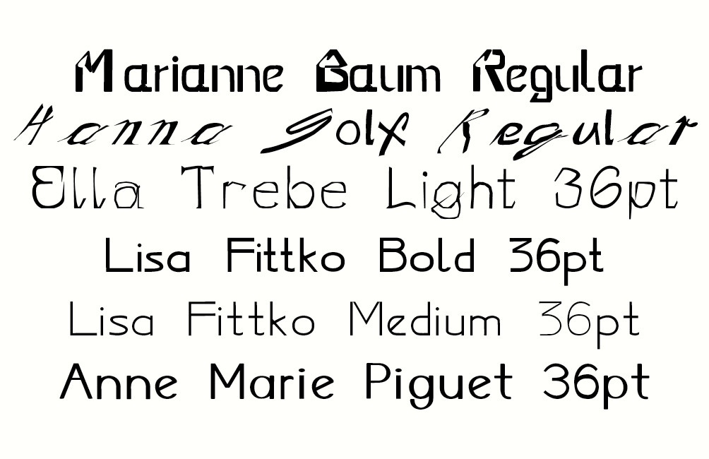
Mrs Eaves became a typeface in 1996. Prior to that she was a minor figure in the history of typography: Sarah Eaves, housekeeper, lover, and colleague of John Baskerville, who became famous for his work with print and type after his successes with japanning and other decorative industries in eighteenth century Birmingham. Abandoned by Mr Eaves, with whom she had five children, Sarah moved in with Baskerville but only married him sixteen years later when she learned of the death of Mr Eaves. Some of her children took the Baskerville name and worked in the same trade; Sarah herself worked alongside Baskerville, and completed the printing of the volumes on which he had been working when he died. In this she was not at all unique, neither the first or the last woman to take over from a husband in the trade: as well as completing the works left by Giambattista Bodoni on his death, Margherita Dall’Aglio Bodoni went on to produce the 1818 Il Manuale tipografico, known as “the specimen book to end all specimen books”.1 Mrs Eaves is itself a continuation, and also an unorthodox development, of the typeface to which Baskerville gave his own name. Naming it after Sarah Eaves was a brilliant move. Within a few years it had become one of the most successful typefaces of its day, releasing Sarah Eaves from her supporting role between the lines of Baskerville’s life and putting her on the typographical map. Her role in the history of type was recognised not with a statue or a public square, but right at the level on which she worked, in print, with a typeface of her own, just like Baskerville himself. The medium really is the message here: she was a vehicle for Baskerville, and it is as a vehicle that her name lives on.
Typefaces are carriers, media — text is set not in stone, but in Baskerville, or Mrs Eaves. And like any medium, a typeface is hugely influential on whatever it conveys and communicates. It tends to be rather disparaged too, as is often the case with infrastructure. Typography is sullied by its association with the messy, dirty world of foundries, presses, ink and machines, and just as pages, scrolling, and books continue to structure the digital interface, so the language of mechanical printing persists: typefaces are now cast in digital foundries, and letters are still divided with reference to the two wooden cases, the upper and lower, in which each series of letters were once laid out. Typography is also undervalued because of the minor nature of its concerns with secondary, superficial aspects of the written word: the selection of a typeface is simply a question of style, an aesthetic, even decorative decision about the formal arrangement of the infinitely more important content of language, which is — well, what? In the West we are long used to thinking about writing as a matter of phonetics, the transcription of the spoken word, and speech in turn as a rendition, a performance of the thought that awaits articulation, that which is to be expressed. Writing may require a script, a way of writing; and choices about typefaces have to be made. But by convention these are mere details, incidental to the real work of language as the transcription of thought.
But type remains inescapable. No matter how minor and pedestrian the question may seem, typographical choices about the appearance of letters, words, and sentences have to be made: writing cannot happen without them. This concerns every aspect of the printed word: the lines, the frames, the conventions of spacing, sizing, colour, layout, and font, as well as the typefaces themselves. And we know how influential these choices can be on how a text is read and received. Put the same text in a different typeface: how does it look now? And where is it, when it’s not in any of them? Is it anywhere at all? Typography remains an issue either way. Even for those for whom the appearance of the text is barely relevant and quite subordinate to the meaning it conveys, it still has to appear somehow. It may be merely a vehicle, used by thought to get around, but type has to show its face. Zuzana Licko, the woman who designed and named Mrs Eaves (and also continued the story with the launch of Mr Eaves in 2009), has observed that the lack of public recognition for her work is due not to her gender but rather to her trade.2
Perhaps this comes down to the same thing: neither art nor science, and right at the heart of the machinery of writing, typography shares the neglected no man’s land also occupied by textiles, ceramics, all sorts of design, and much of the activity historically known as women’s work. It plays in the minor key, too entangled with the machinery of writing, the body of the text and its processes, to be admitted the purer airs of high culture. It is expected to look good, but to know its place in the background too; its proportions are admired, but it is also despised for its heightened concern with image and appearance. It transmits, but it does not create. It mediates and supports, facilitating the real work of production that is happening elsewhere.
Digitisation gives such infrastructure a new weight. Vilém Flusser sees the electronic image confronting the linearity of alphabetic writing with a new visual era: drawing precedes writing, in the individual and historically, and now takes precedence again. But writing, by hand or machine, as calligraphy or typography, has always been a visual practice: the typeface is itself a series of images, a constant reminder of the persistence of the visual in the written word. Letters are subject to highly formalised constraints but they are still drawings, even portraits of a kind: letters have ears and collars, arms and legs, shoulders, spines, and chins, and the sixteenth century engraver Geoffroy Tory even imagined his letters to be little men, parading like stick figures on the page: in Champfleury, The Art and Science of the Proportion of the Attic or Ancient Roman Letters, According to the Human Body and Face, he even modelled his letters on the male form: “the cross-stroke covers the man’s organ of generation, to signify that Modesty and Chastity are required, before all else, in those who seek acquaintance with well-shaped letters”.3
Fraktur, the heavy Gothic typeface in which most German language texts were printed well into the twentieth century, is the typeface most closely associated with Hitler’s Germany. But Hitler himself was not a Fraktur fan: he wanted a more modern script to be the face of the Third Reich, and favoured the use of Antiqua, normally used only for printing Latin texts. The old German script, he declared, “does not fit well in this age of steel and iron, glass and concrete, of womanly beauty and manly strength, of head raised high and intention defiant”. It looked old fashioned; it was too ornate, too prominent, too visible: indeed, one of the arguments in favour of its use was that the Gothic script was more open to typographical experiment than the simple, definitive letters of the Latin face, which confines typeface design to tiny details, subtle shifts, small strokes and fine adjustments here and there. The letters can vary in appearance, but not too much: the constraints are high, the room for manoeuvre small. And this was precisely what made it attractive to Hitler. Antiqua was clean and streamlined and so, and most importantly, more accessible to a global audience: Fraktur and the other Gothic scripts were barely legible beyond Germany. In 1941 he got his way: having long been considered the truly German script, an edict condemning Fraktur as “Jewish lettering” was issued (ironically on paper headed in Fraktur) in an attempt to establish Antiqua as the new face of the German language: “in the future the Antiqua script is to be described as normal script. All printed materials are to be gradually converted to this normal script.”4
Normal script: so that all the others are abnormal, undesirable, to be replaced. The normal face of the normal type, and everyone else to be removed. This was the real typecasting of the day (and it is never far away). The Aryan mothers, faithful to Kinder, Küche, and not even Kirche, but the Führer himself: these were the good ones, women of the right type. Jews, Roma, prostitutes, abortionists, lesbians, schizophrenics, communists — these were the other types of women, the wrong types, to be shot, starved, tortured, worked to death. Resistance was more or less futile, and often confined to small scale operations and little acts of defiance — a man rescued, a song smuggled out, a task refused, a process sabotaged. Putting faces to the names of women of these types, who fought against the odds and mostly lost, is not a way to put them on display, in a frame or on a pedestal; it makes no effort to recover their stories and represent their lives, but intervenes at another point in the very infrastructure of communication in which these women also worked, as messengers, go-betweens, decoys and spies, maybe also as mothers or wives. It draws them out and turns them loose, extending their reach, putting them into circulation in another time, a different economy. It animates them, activates them, gives them currency. It honours and multiplies the things done in their names. It gives them faces once again.
Endnotes
1. https://graphicarts.princeton.edu/2016/05/31/the-specimen-book-toend-all-specimen-books
2. “It’s not a problem of being a woman in a man’s world. It’s being a
type designer in a world that gives little recognition to this art form”, Eye 43,
Spring 2002, www.eyemagazine.com/feature/article/reputations-zuzana-licko
3. Elen Lupton, “Thinking with Type: A Critical Guide for Designers,
Writers, Editors, & Students”, Chronicle Books, 2014
4. https://en.wikipedia.org/wiki/Antiqua-Fraktur_dispute